My blog

Just another WordPress site

Self Analysis/Color Studies

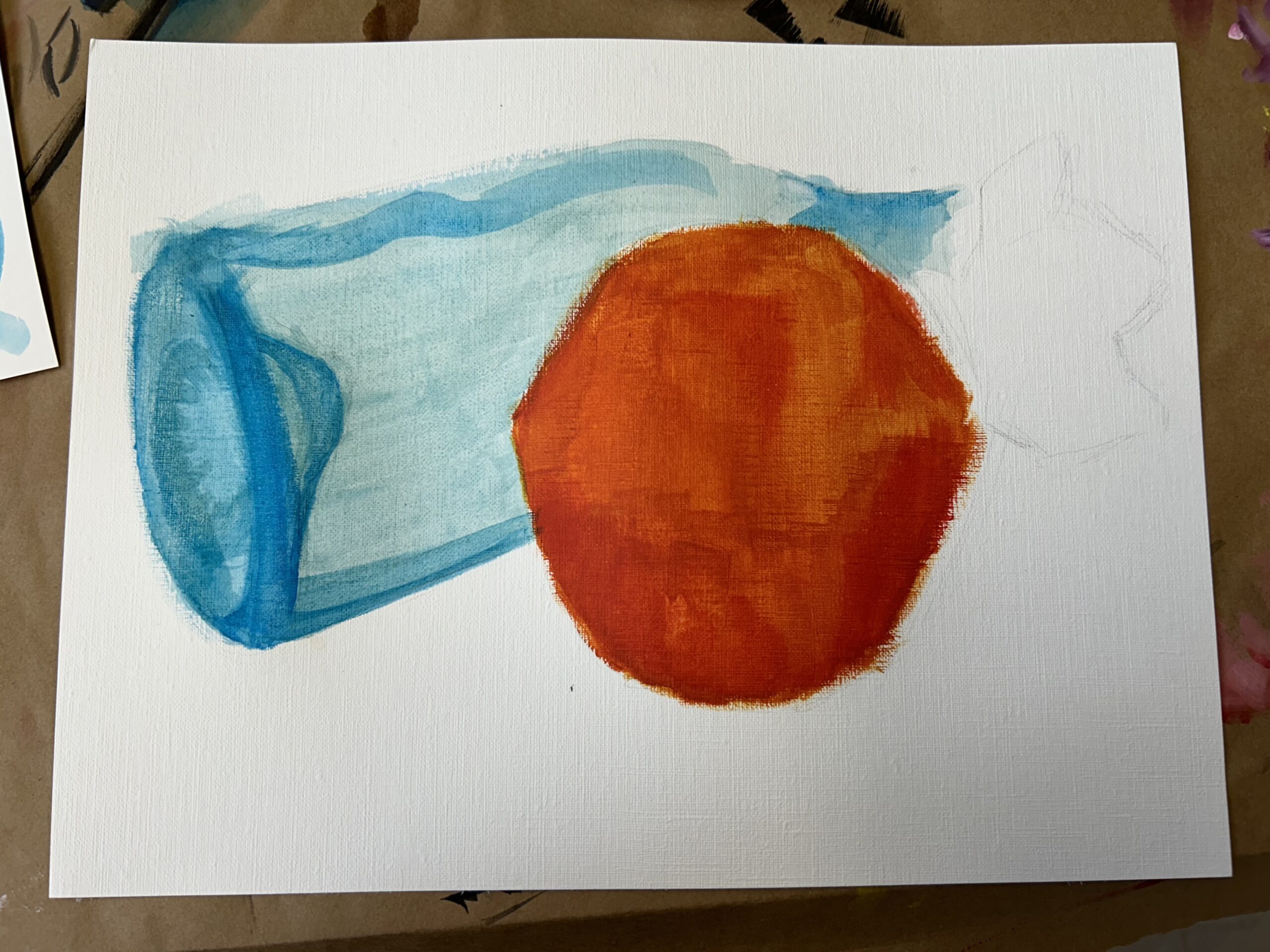
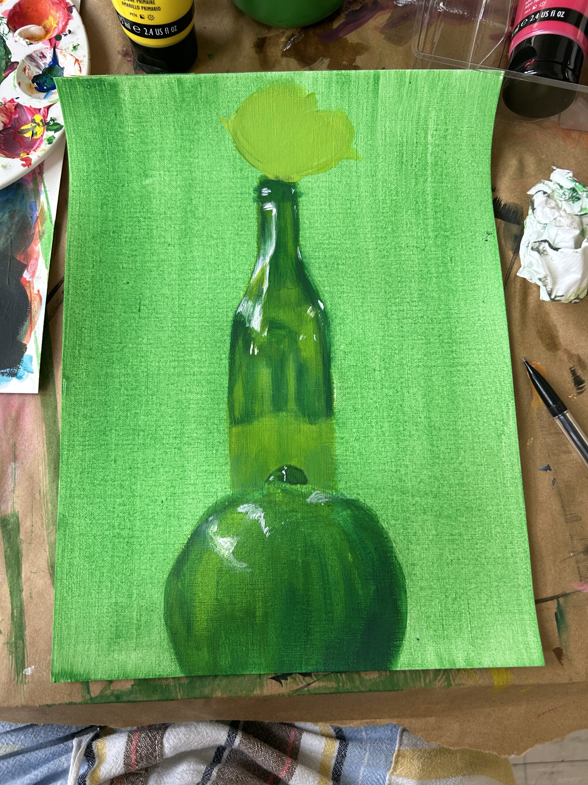
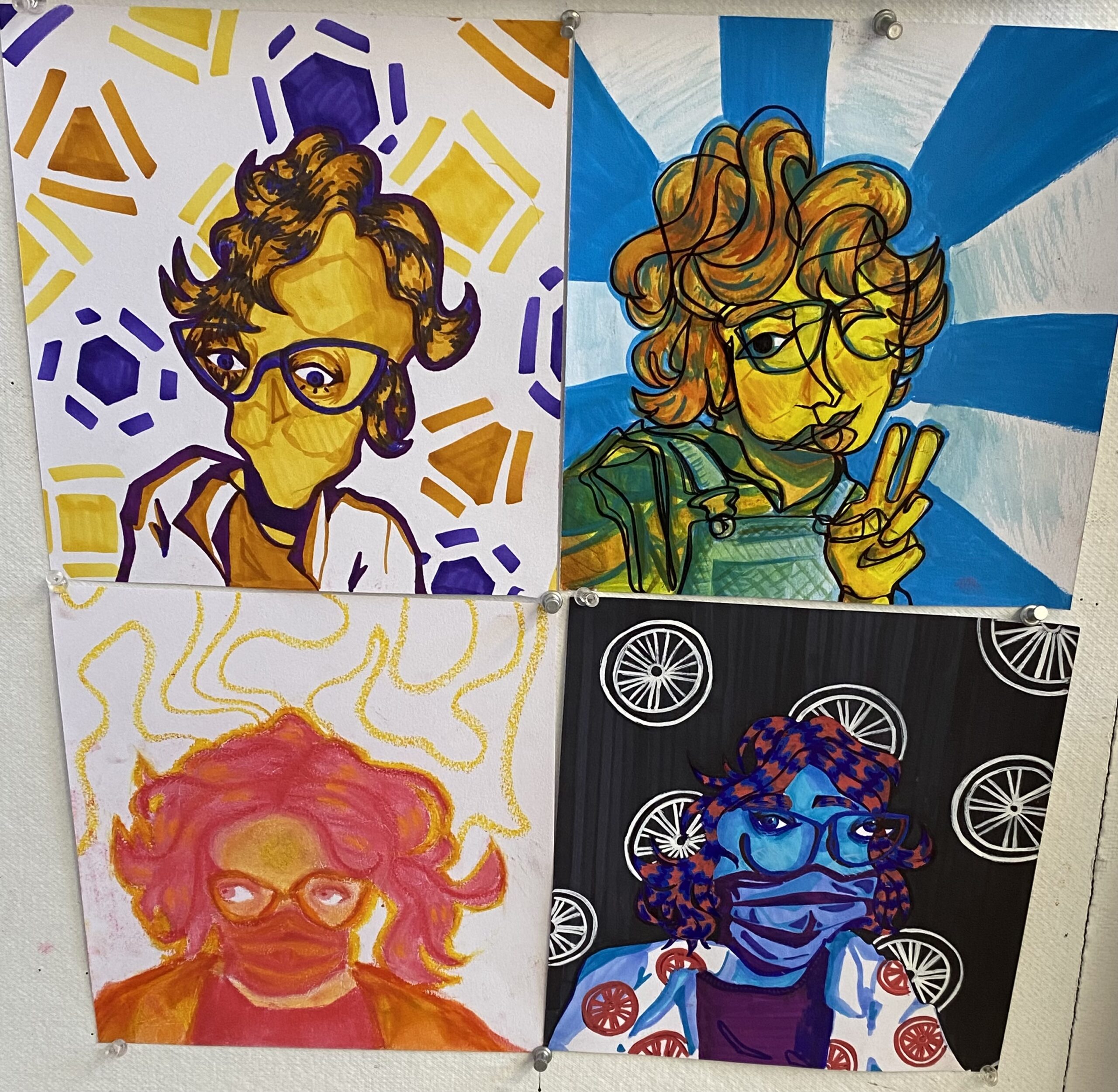
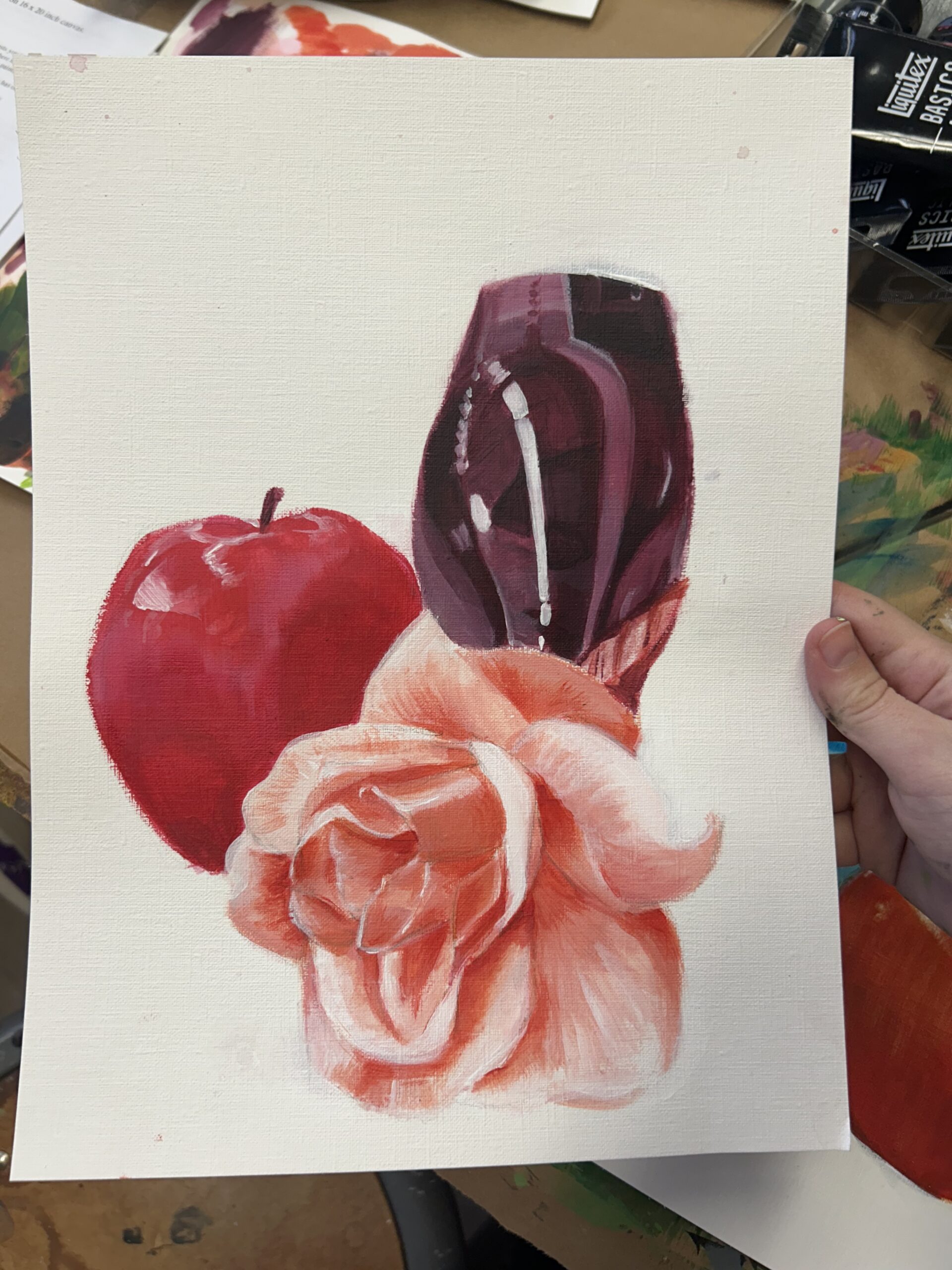
Since this was my first time painting, I wanted to get a full range of color experimentation. So, throughout my four pieces, I think the whole rainbow is pretty much accounted for. I also knew I wanted to limit myself to one simple collection of objects for all four works so that I could really focus in on understanding the use of color. I don’t think I really encountered any “issues” per se? I’m sure there are a lot of things I could have been doing with better technique, but nothing overall frustrated me too badly. If anything, it was just and issue of my own patience, but event that wasn’t too bad with so many pieces to switch between working on. I also got stressed out if I didn’t use all of my paint in one sitting, but that’s also more of a me issue. A problem didn’t necessarily provoke this, but since the first rendition of the bottle was very opaque in it’s shapes and strokes, I decided to try a more translucent layering of paint for the next bottle. And I really like them both! I’m pretty satisfied with how my pieces turned out; it was about what I envisioned. I would definitely like to go back and change/add some dimension to the backgrounds because right now they are either blank or ugly. And that’s okay! I’m still getting a hang of this stuff! But I would like to fix it…
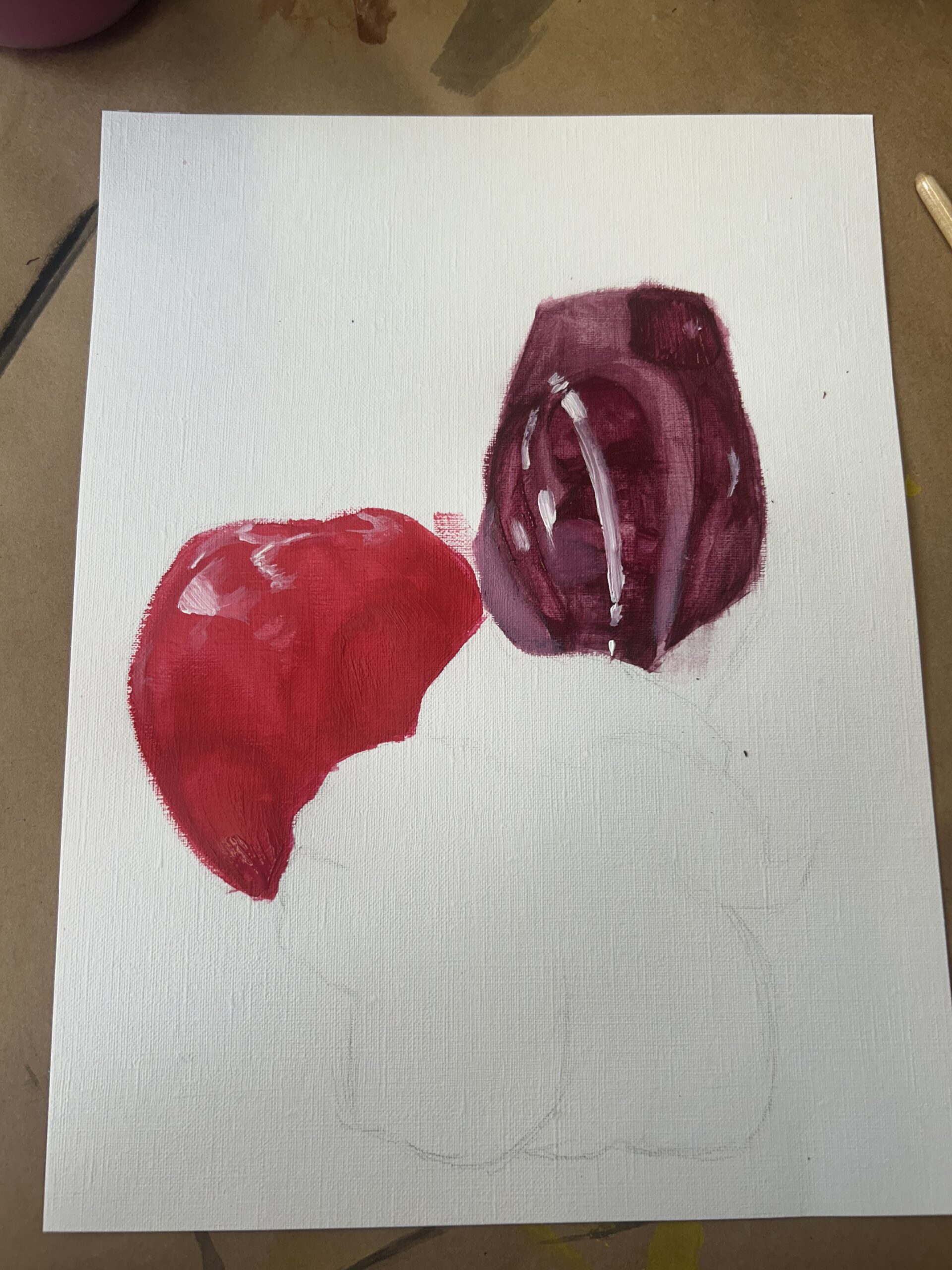
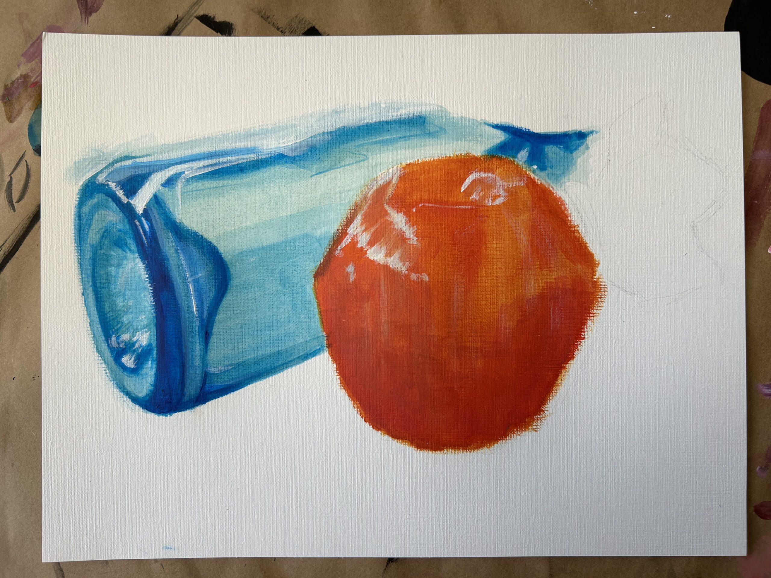
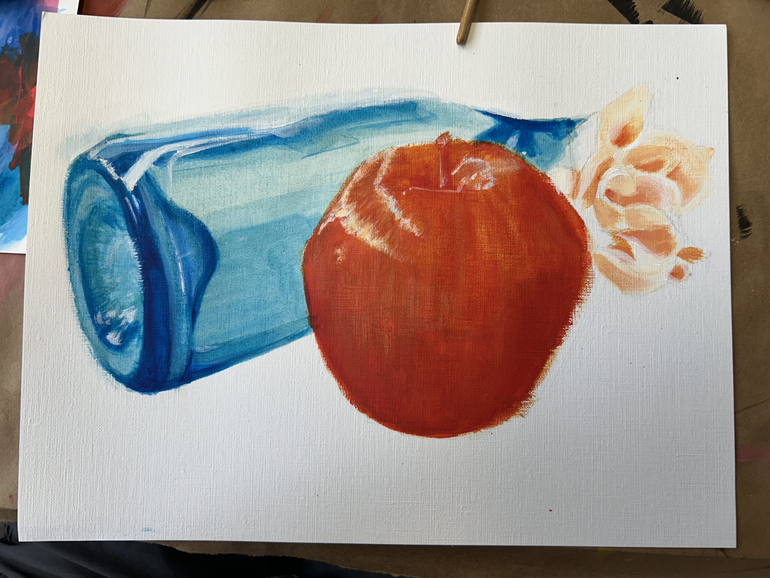
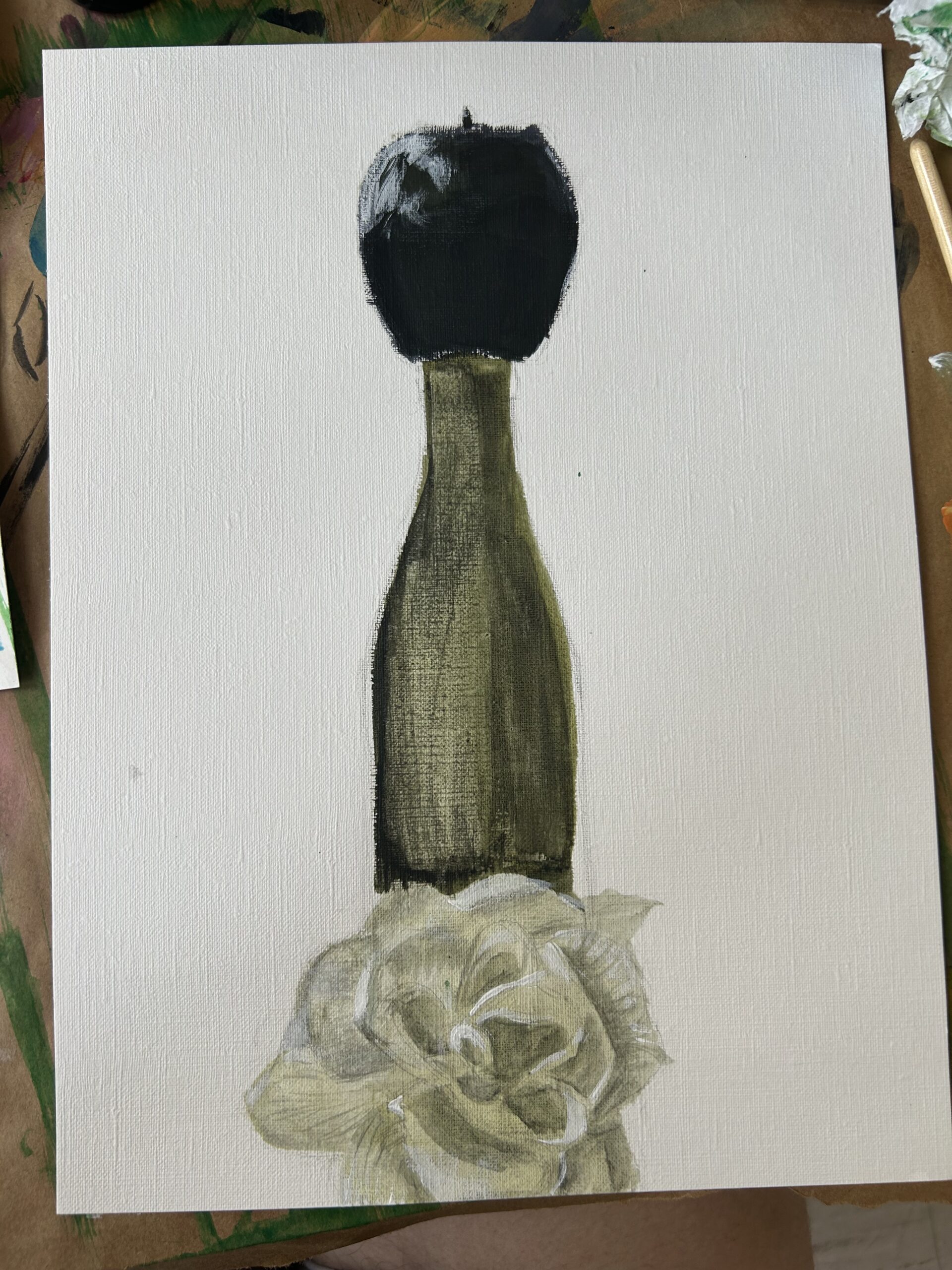
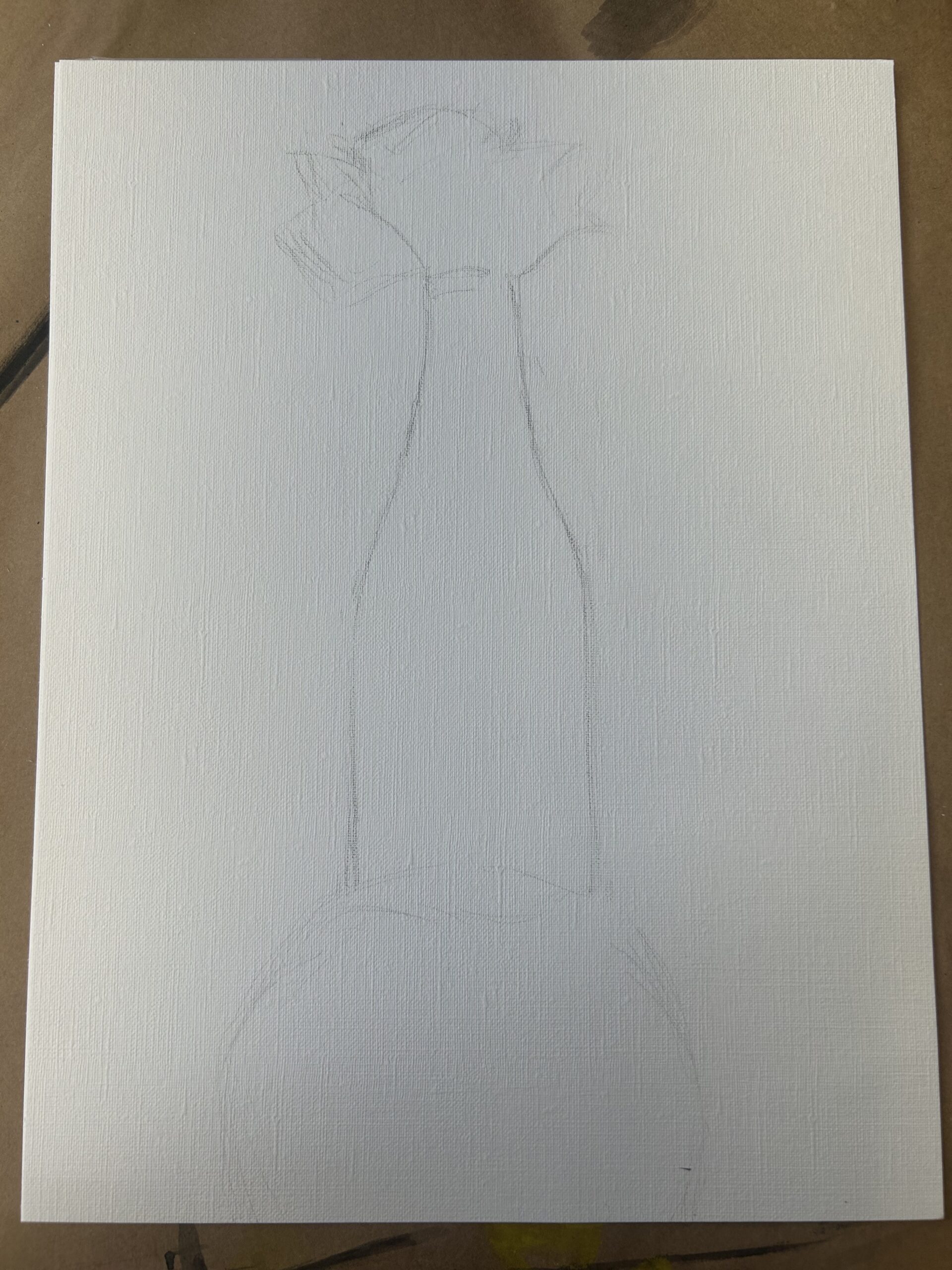
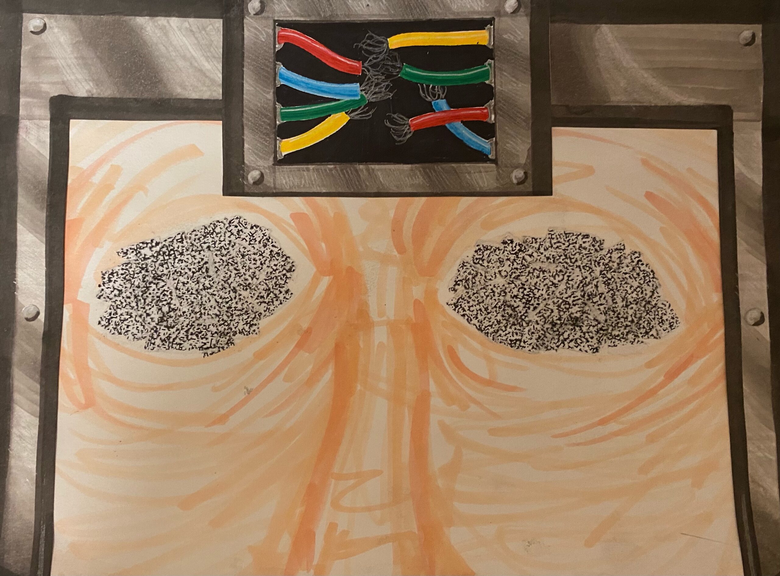
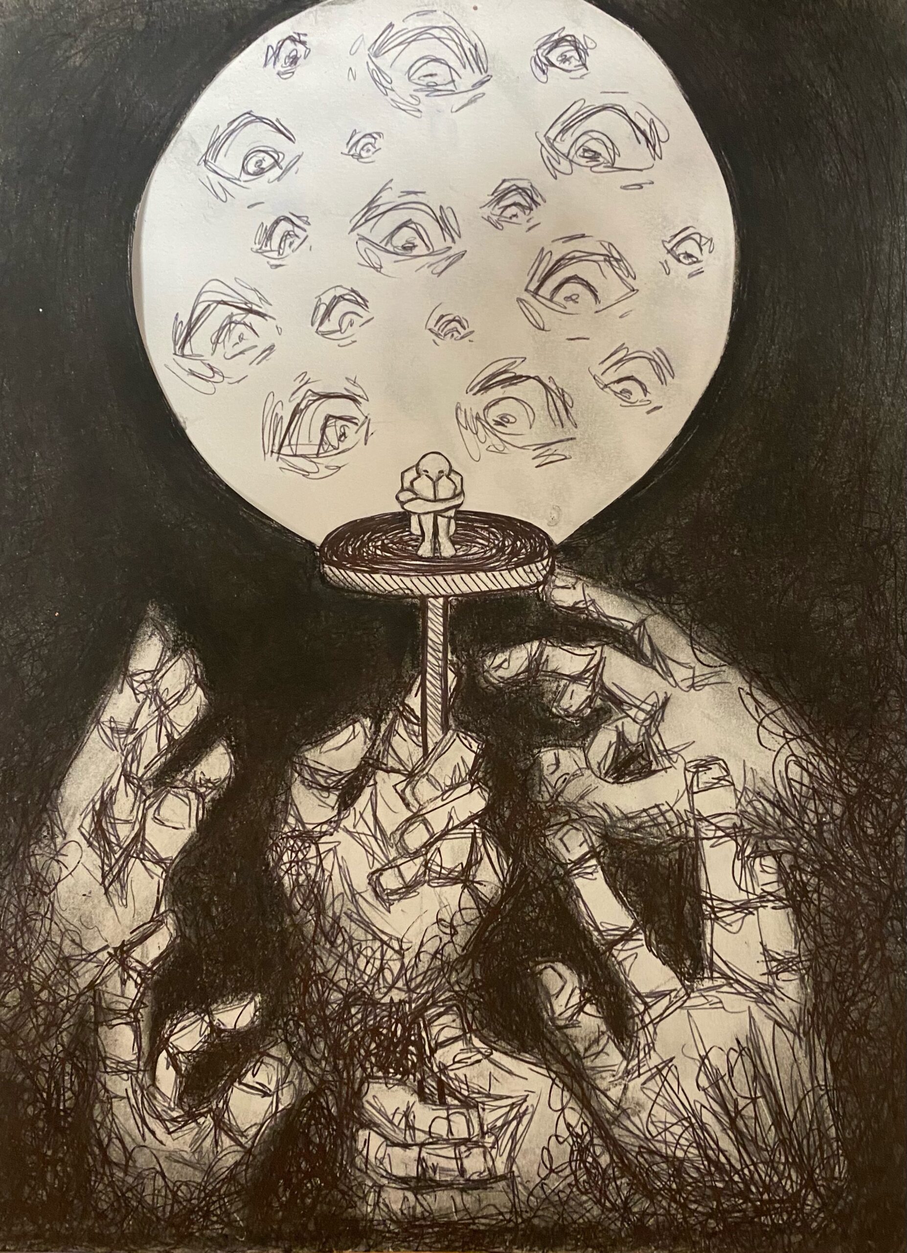
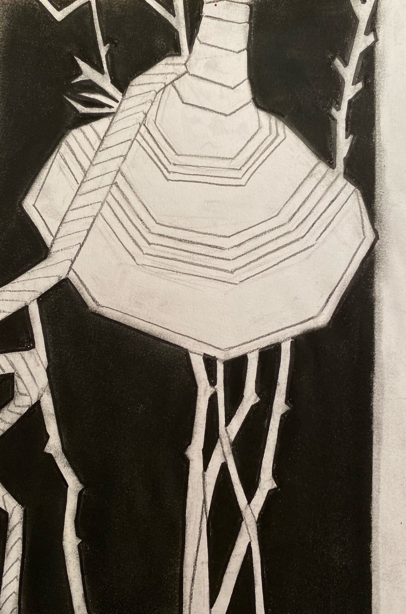
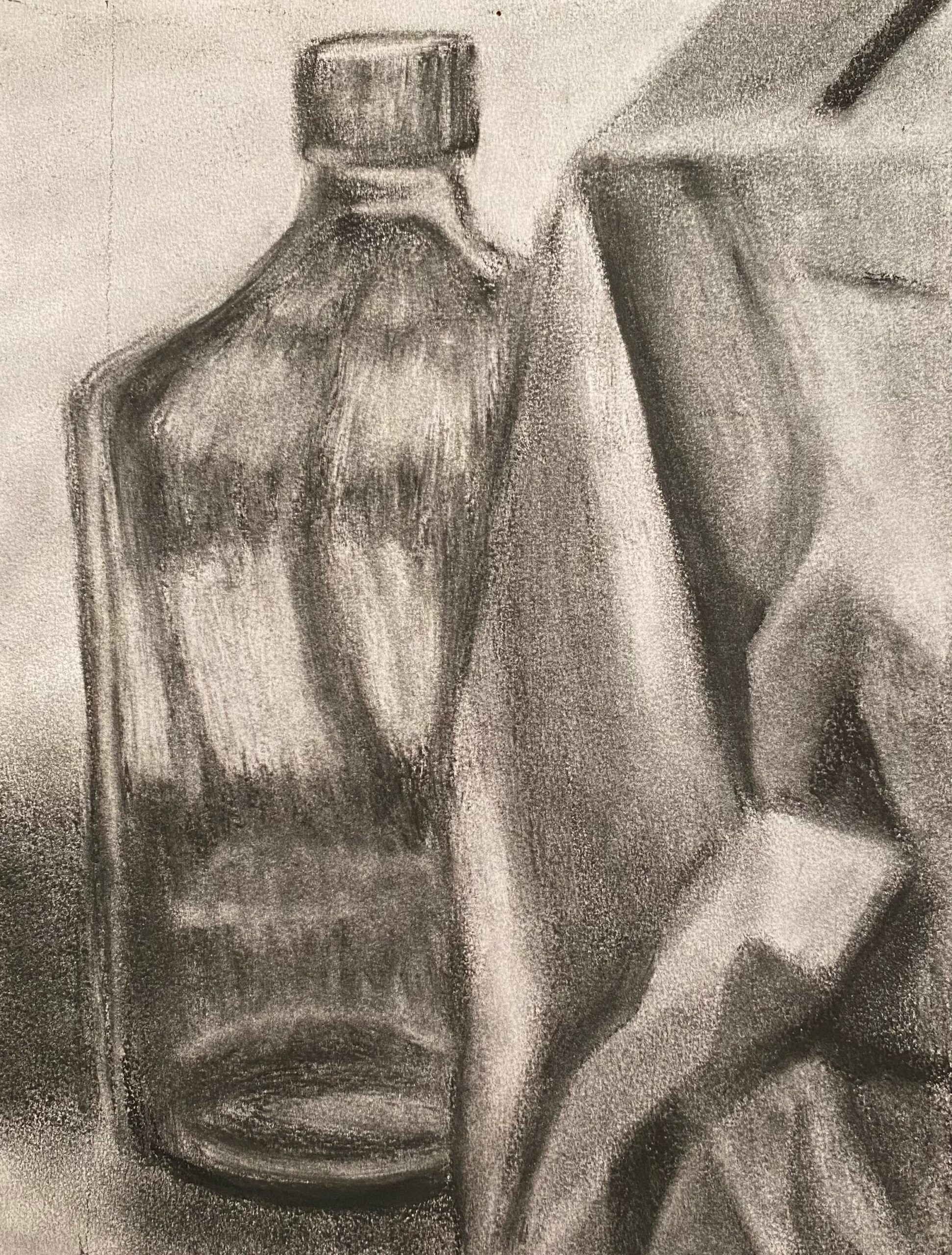
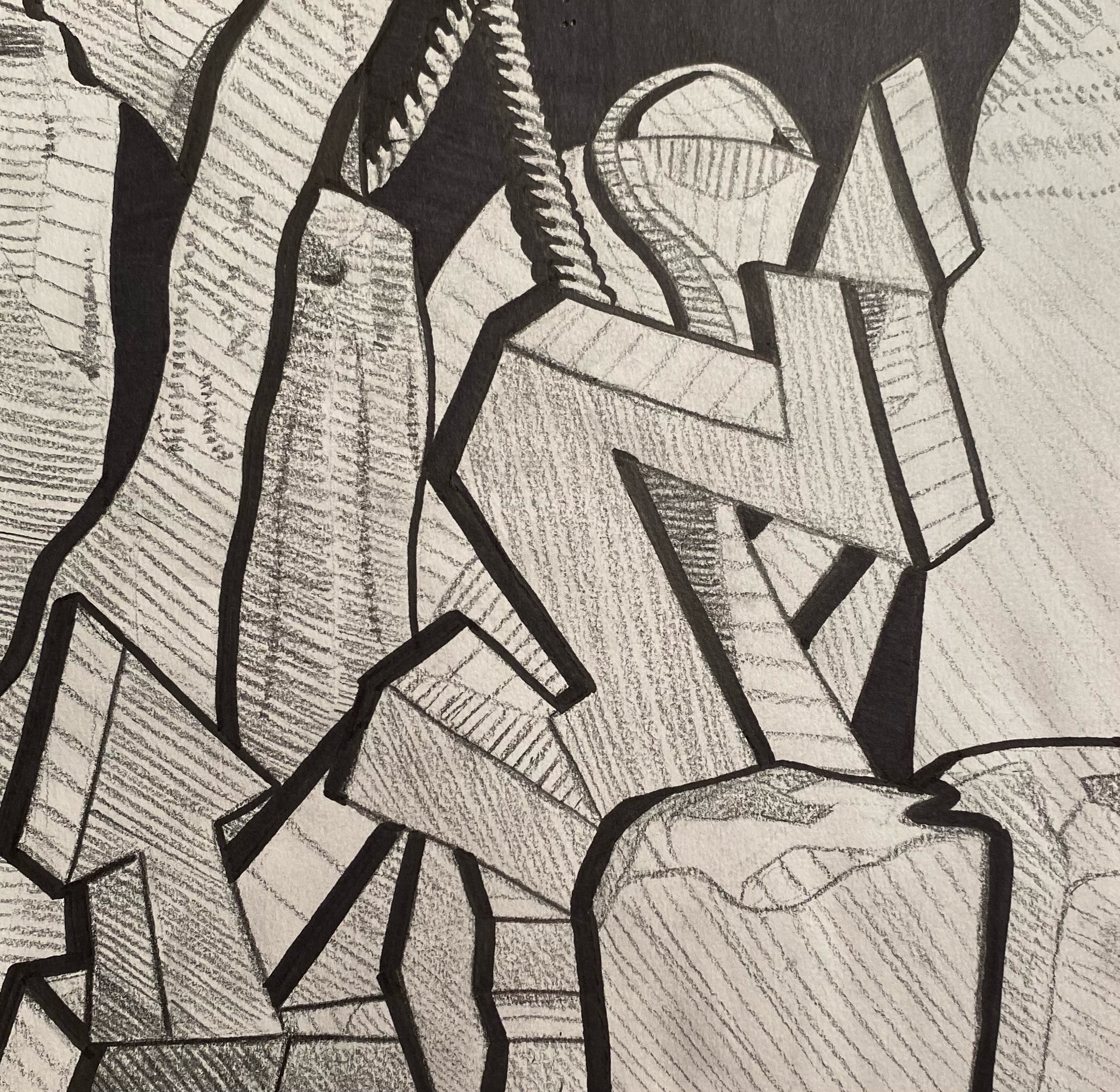
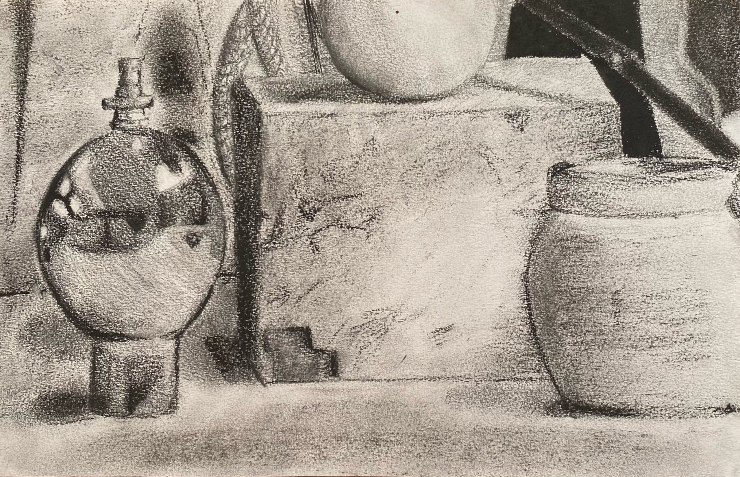
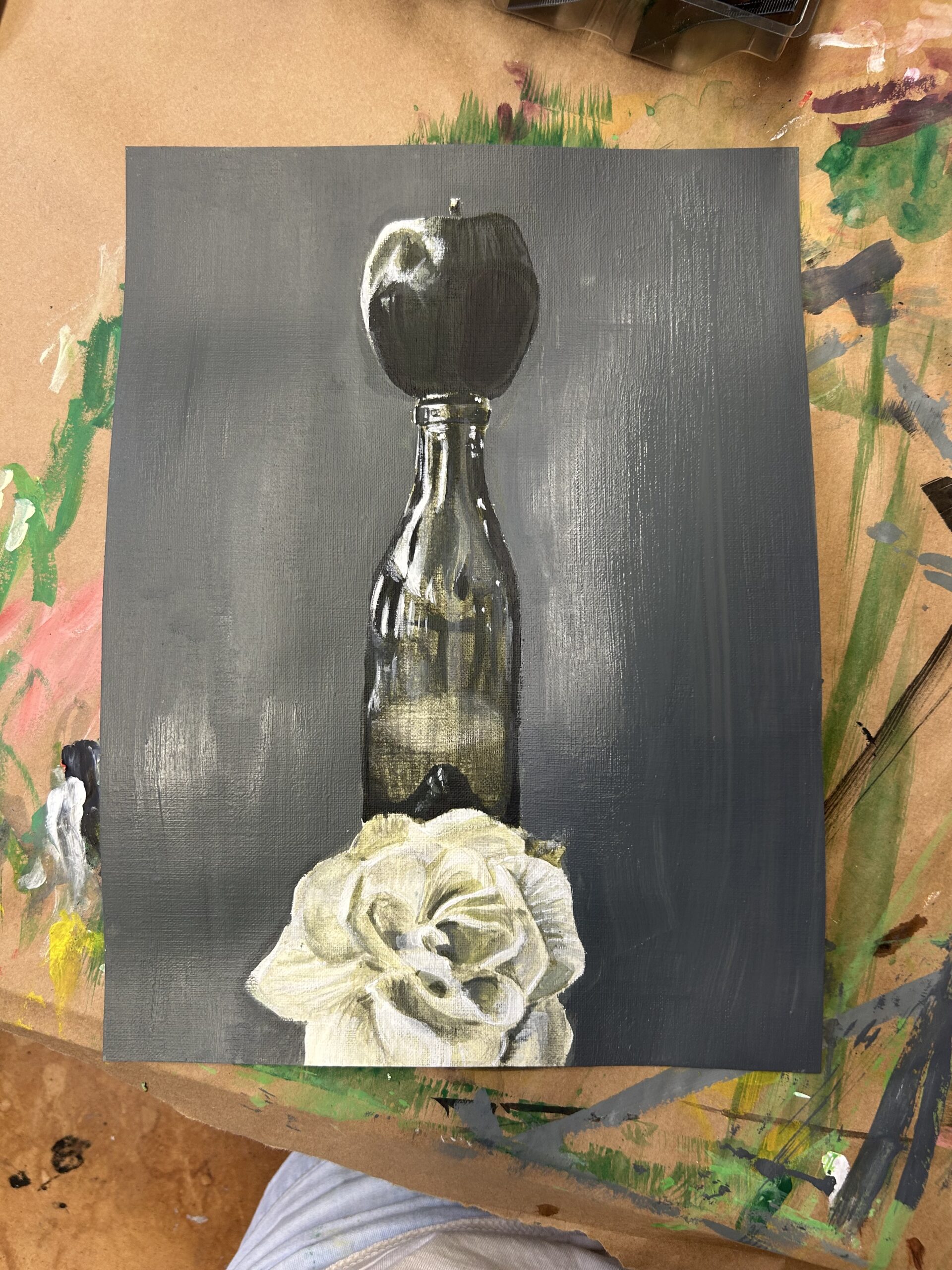
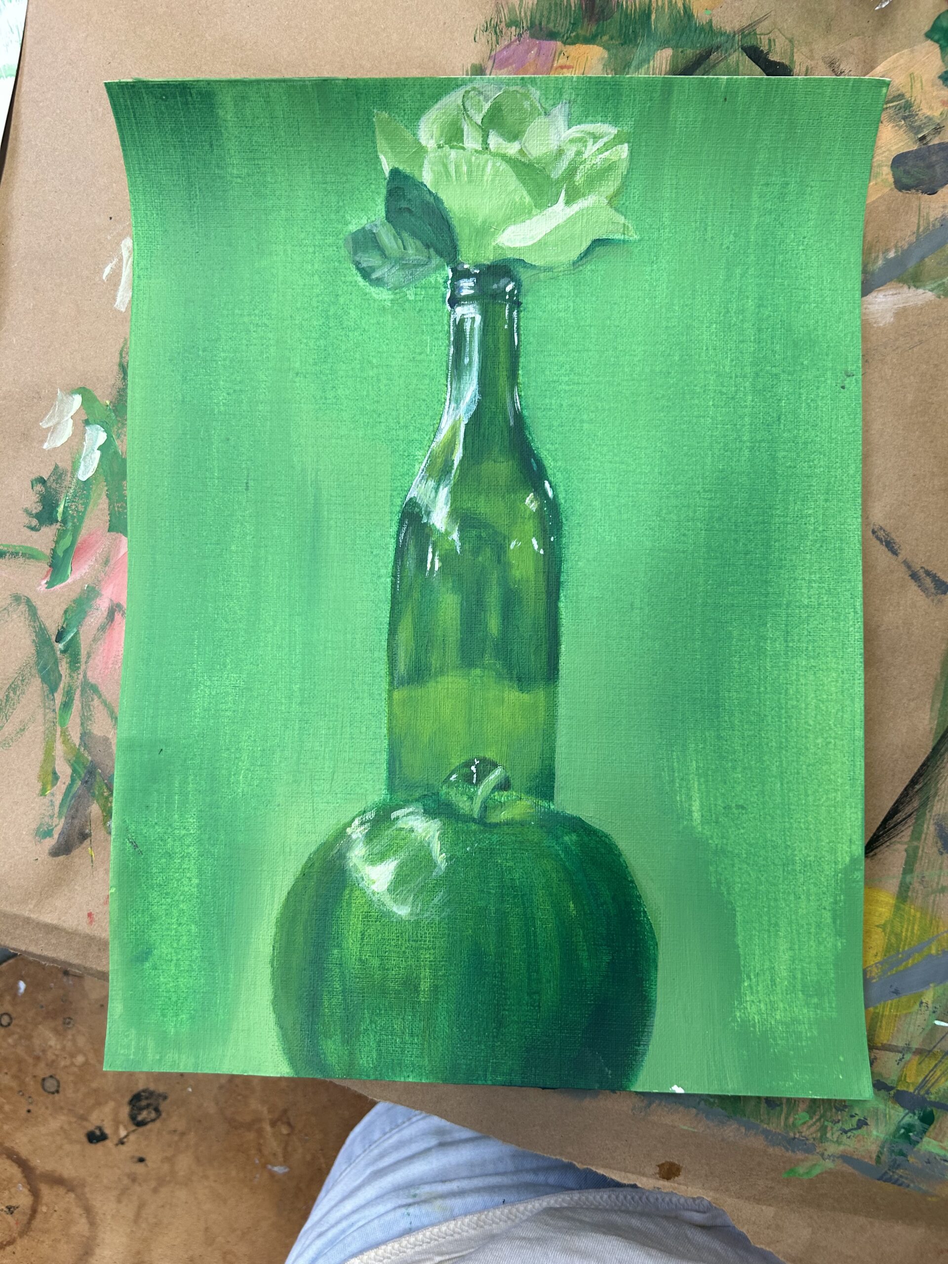
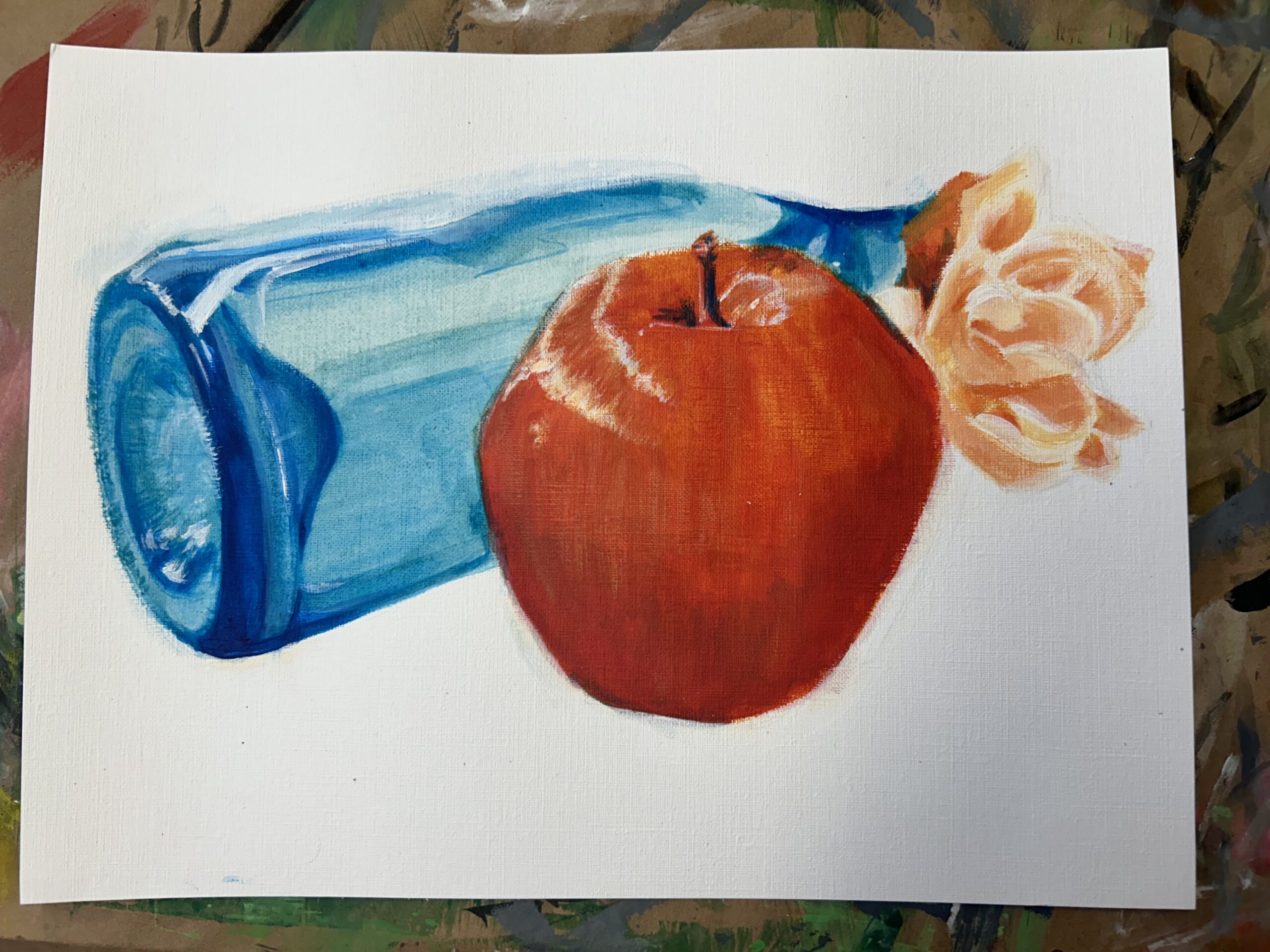
Process Pics:

Final Project – Series

I decided to do a series for this final project focused on mental illness I experience. I ended up using a large variety of materials alongside the incorporation of some collage techniques to produce the final products. The top left exhibits a feeling of dissociation- when your body doesn’t really feel real. So I wanted it to look like someone was watching their hands dissolve. Completely out of touch. The top middle is centered around the idea of masking your mental state until you can’t anymore. You feel like you’re puppeteering yourself throughout everyday just to make it through, but eventually even that becomes to cumbersome. So I wanted it to look like the puppeteer had lost focus/ had fallen asleep, leaving the puppet itself motionless and unable to perform. The top right was just to represent a general feeling of disconnect in my head. I wanted to convey the idea that similar to a machine, something had been broken, not bruised. I also wanted that technological look so I could have TV static in the eyes, representative of how those snapped wires screw with my perspective of myself and those around me. And the last one was to show a general feeling of overwhelm and isolation. There’s this instability of this tiny platform with all this sensory surrounding it. I wanted it to look the way I feel when my brain is screaming “things are too much”. Overall, it was really fun to explore these concepts and learn how to handle some unfamiliar materials! I was surprised by the vibrancy of the watercolors! I would probably do the wire one a little differently. If nothing else, I’d use watercolor for the skin/face instead of messy marker.

4 drawings

This first assignment felt very intimidating for me as someone who hadn’t taken an art class since elementary school. My approach was basically to just get started on the first drawing and see where it took me. I discovered how burdening my perfectionist tendencies were after hours of work toward that one piece. While I was proud of how my first drawing had turned out, I was also far too burnt out to attempt to proceed with that technique of drawing for my next three things. Because of that, I actually allowed myself to branch out into new areas of experimentation with art styles. As a result, I actually gained a lot of new knowledge regarding how these materials work that I can use for future projects. My least favorite material but initial instinct was for sure charcoal. The fact that it’s harder to control clashes with my want to have things precise and perfect, but it has really grown on me since then. While I don’t think I’ll ever use it for a background value ever again, I’ve come to really love it’s potential messiness and the life that kind of texture can add to a drawing. That said, I think my drawing of the bottle and fabric was the most successful in terms of me learning to embrace materials that made me uncomfortable to work with, but I do still really love my first drawing with the urn in it. I feel like my least successful drawing is the positive/negative study of the lamp. I think there was a misuse of charcoal in that drawing; I wanted clean, bold lines, but instead, smudges will forever cover the white of that drawing. I think it could have become a more interesting piece if I had added more intricate line work as well. I hope to continue breaking out of my comfort zone in future assignments to improve my art skill.

First Post

This is a template for your first post! Click “edit post” on the upper bar, or go to Dashboard>Posts>All Posts and click the title above to edit the content.

© 2024 My blog

Theme by Anders NorenUp ↑

css.php